Visualizing Musical Analysis Results: Plotting Motif Distributions and Timelines
Introduction
Once you’ve identified motifs in a musical score, the next crucial step is visualization. Effective visualizations transform raw data into insights, revealing patterns, distributions, and relationships that might not be apparent from numbers alone.
In computational musicology, visualization serves multiple purposes:
- Exploratory analysis: Understanding the structure of your data
- Pattern discovery: Identifying recurring motifs and their characteristics
- Communication: Presenting findings to other researchers or musicians
- Validation: Verifying that your analysis methods are working correctly
This post explores visualization techniques for musical motif analysis, building on the motif identification methods we discussed previously.
The Visualization Toolkit
Our visualization approach uses three key functions:
- Distribution plots: Understanding motif length patterns
- Timeline visualizations: Seeing when and where motifs occur
- Color mapping: Distinguishing different motifs visually
Let’s examine each in detail.
Function 1: Plotting Motif Distributions
def plot_motif_distribution(
    motifs: List[Any],
    title: str = "Motif Distribution",
    output_path: Optional[str] = None,
) -> None:
    if not motifs:
        raise ValueError("Motifs list cannot be empty")

    lengths = [len(m) for m in motifs]

    plt.figure(figsize=(10, 6))
    plt.hist(lengths, bins="auto")
    plt.title(title)
    plt.xlabel("Motif Length")
    plt.ylabel("Frequency")

    if output_path:
        plt.savefig(output_path)
    plt.close()
What This Function Does
The plot_motif_distribution function creates a histogram showing how many motifs exist at each length. This simple visualization reveals important characteristics:
- Most common motif length: Which length appears most frequently?
- Length diversity: Does the piece use motifs of many different lengths, or focus on a few?
- Distribution shape: Are motifs evenly distributed, or clustered around certain lengths?
Understanding the Output
A typical distribution plot might show:
- A peak at length 3-4: Short motifs are building blocks
- Fewer longer motifs: Longer sequences are less common
- Tails at both ends: Very short (2 notes) or very long (8+ notes) motifs are rare
Enhanced Version
Here’s an enhanced version with more detail:
def plot_motif_distribution_enhanced(
    motifs: List[Any],
    title: str = "Motif Distribution",
    output_path: Optional[str] = None,
    show_stats: bool = True,
) -> None:
    """Enhanced version with statistics and styling."""
    if not motifs:
        raise ValueError("Motifs list cannot be empty")

    lengths = [len(m) for m in motifs]

    fig, ax = plt.subplots(figsize=(12, 6))

    # Create histogram
    n, bins, patches = ax.hist(lengths, bins="auto", edgecolor='black', alpha=0.7)

    # Color bars by frequency
    max_freq = max(n)
    for i, (bar, freq) in enumerate(zip(patches, n)):
        bar.set_facecolor(plt.cm.viridis(freq / max_freq))

    # Add statistics
    if show_stats:
        mean_len = np.mean(lengths)
        median_len = np.median(lengths)
        ax.axvline(mean_len, color='red', linestyle='--', linewidth=2, label=f'Mean: {mean_len:.2f}')
        ax.axvline(median_len, color='blue', linestyle='--', linewidth=2, label=f'Median: {median_len:.2f}')
        ax.legend()

    ax.set_title(title, fontsize=14, fontweight='bold')
    ax.set_xlabel("Motif Length (number of notes)", fontsize=12)
    ax.set_ylabel("Frequency", fontsize=12)
    ax.grid(axis='y', alpha=0.3)

    plt.tight_layout()

    if output_path:
        plt.savefig(output_path, dpi=300, bbox_inches='tight')
    plt.close()
Function 2: Plotting Motif Timelines
def plot_motif_timeline(
    score: music21.stream.Score,
    motifs: List[List[music21.note.Note]],
    output_path: Optional[str] = None,
) -> None:

    if not motifs:
        raise ValueError("Motifs list cannot be empty")
    if not score.parts:
        raise ValueError("Score must have at least one part")

    plt.figure(figsize=(15, 8))
    # Implementation would depend on how you want to visualize the timeline
    # This is a placeholder for the actual visualization logic

    if output_path:
        plt.savefig(output_path)
    plt.close()
Why Timeline Visualization Matters
Timeline visualizations answer critical questions:
- When do motifs appear? Are they clustered at the beginning, end, or distributed throughout?
- How do motifs relate to structure? Do they align with section markers (like “Tawchiya”, “Mshalia” in Arab-Andalusian music)?
- Are there patterns? Do certain motifs always appear together or in sequence?
Complete Implementation
Here’s a complete implementation based on the Arab-Andalusian music analysis:
def plot_motif_timeline(
    score: music21.stream.Score,
    motif_counts: dict,
    text_expressions: dict = None,
    filename: str = "",
    output_path: Optional[str] = None,
) -> None:

    if not motif_counts:
        raise ValueError("Motif counts dictionary cannot be empty")

    measures = score.parts[0].getElementsByClass('Measure')
    total_measures = len(measures)
    unique_motifs = list(motif_counts.keys())

    # Calculate max count for consistent y-axis
    max_count = max(max(counts.values()) if isinstance(counts, dict) else 0
                    for counts in motif_counts.values())

    # Create subplots for each motif
    n_motifs = len(unique_motifs)
    fig, axs = plt.subplots(n_motifs, 1, figsize=(14, 3 * n_motifs), sharex=True)

    if n_motifs == 1:
        axs = [axs]

    palette = plt.cm.Pastel2.colors

    for i, (motif, counts) in enumerate(motif_counts.items()):
        # Create measure-by-measure count array
        measure_counts = [counts.get(m, 0) for m in range(1, total_measures + 1)]

        # Plot as bar chart
        axs[i].bar(range(1, total_measures + 1), measure_counts,
                   color=palette[i % len(palette)], width=1.0)

        # Add section markers if provided
        if text_expressions:
            for measure_num, label in text_expressions.items():
                axs[i].axvline(x=measure_num, color='black',
                              linestyle='--', linewidth=0.75, alpha=0.7)

        # Styling
        axs[i].set_title(f'Cento: {motif}', fontsize=11, fontweight='bold')
        axs[i].set_ylabel('Counts', fontsize=10)
        axs[i].set_ylim(0, max_count)
        axs[i].set_yticks(np.arange(0, max_count + 1, 1))
        axs[i].grid(axis='y', linestyle='--', alpha=0.5)
        axs[i].set_xticks(np.arange(20, total_measures, 20))

    # Common x-axis label
    axs[-1].set_xlabel('Measure Number', fontsize=12)

    # Overall title
    plt.suptitle(f'Distribution of Centos across {filename}',
                 fontsize=14, fontweight='bold', y=0.995)

    plt.tight_layout(rect=[0, 0, 1, 0.98])

    if output_path:
        plt.savefig(output_path, dpi=300, bbox_inches='tight')
    plt.close()
Real-World Example
In the Arab-Andalusian motif analysis, this visualization revealed:
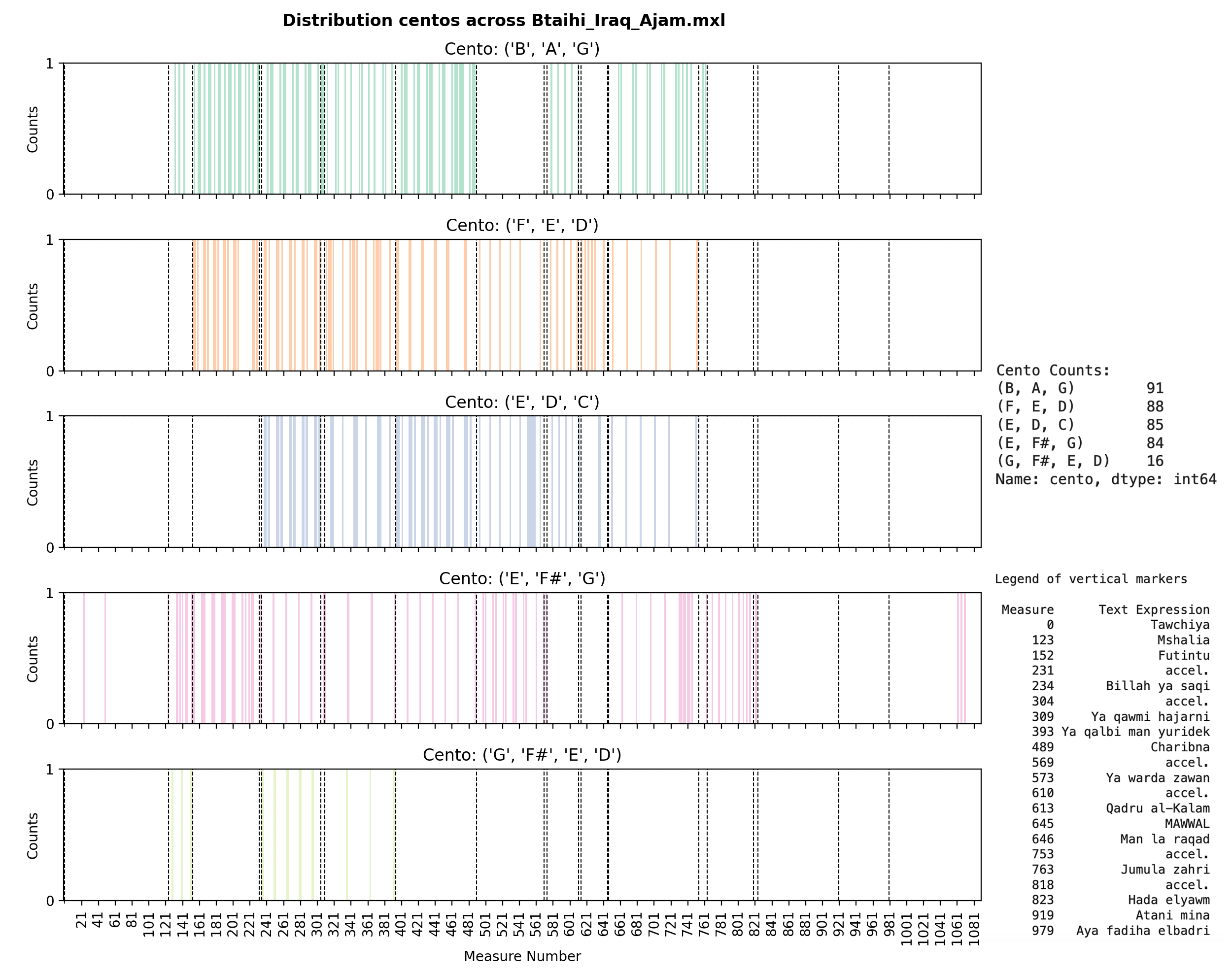
This plot shows:
- Five different centos (motifs) being tracked
- Vertical dashed lines marking structural sections (Tawchiya, Mshalia, Futintu, etc.)
- Bar heights indicating how many times each motif appears in each measure
- Patterns: Some motifs cluster around certain sections, others are more evenly distributed
The visualization makes it immediately clear that:
- The
(B, A, G)cento appears most frequently (91 occurrences total) - Motifs are distributed throughout the piece, not just at the beginning
- Section markers often align with changes in motif density
Function 3: Creating Color Maps
def create_colormap(n_motifs: int) -> np.ndarray:

    if n_motifs < 1:
        raise ValueError("Number of motifs must be positive")

    return plt.cm.viridis(np.linspace(0, 1, n_motifs))
Why Color Mapping Matters
When visualizing multiple motifs simultaneously, color helps:
- Distinguish patterns: Each motif gets a unique, distinguishable color
- Maintain consistency: The same motif always uses the same color across visualizations
- Improve readability: Good color choices make complex plots easier to interpret
Choosing the Right Colormap
Different colormaps serve different purposes:
1. Categorical Colormaps (for distinct motifs)
def create_categorical_colormap(n_motifs: int) -> np.ndarray:
    """Use distinct colors for each motif."""
    if n_motifs <= 10:
        # Use qualitative colormap for small numbers
        return plt.cm.tab10(np.linspace(0, 1, n_motifs))
    else:
        # Use Set3 for more colors
        return plt.cm.Set3(np.linspace(0, 1, n_motifs))
2. Sequential Colormaps (for ordered data)
def create_sequential_colormap(n_motifs: int) -> np.ndarray:
    """Use sequential colors if motifs have an inherent order."""
    return plt.cm.viridis(np.linspace(0, 1, n_motifs))
3. Custom Color Schemes
def create_musical_colormap(n_motifs: int) -> np.ndarray:
    """Create a custom color scheme for musical visualization."""
    # Define a palette that works well for music
    musical_colors = [
        '#1f77b4',  # Blue
        '#ff7f0e',  # Orange
        '#2ca02c',  # Green
        '#d62728',  # Red
        '#9467bd',  # Purple
        '#8c564b',  # Brown
        '#e377c2',  # Pink
        '#7f7f7f',  # Gray
        '#bcbd22',  # Olive
        '#17becf',  # Cyan
    ]

    if n_motifs <= len(musical_colors):
        return np.array([plt.colors.to_rgba(c) for c in musical_colors[:n_motifs]])
    else:
        # Interpolate for more motifs
        return plt.cm.tab20(np.linspace(0, 1, n_motifs))
Accessibility Considerations
When choosing colors, consider:
- Colorblind-friendly palettes: Use tools like ColorBrewer or matplotlib’s built-in accessible colormaps
- Contrast: Ensure colors are distinguishable even in grayscale
- Cultural associations: Be aware that colors may have different meanings in different contexts
def create_accessible_colormap(n_motifs: int) -> np.ndarray:
    """Create a colorblind-friendly colormap."""
    # Use ColorBrewer qualitative palette
    accessible_colors = [
        '#a6cee3', '#1f78b4', '#b2df8a', '#33a02c',
        '#fb9a99', '#e31a1c', '#fdbf6f', '#ff7f00',
        '#cab2d6', '#6a3d9a', '#ffff99', '#b15928'
    ]

    if n_motifs <= len(accessible_colors):
        return np.array([plt.colors.to_rgba(c) for c in accessible_colors[:n_motifs]])
    else:
        # Fall back to Set3 which is generally accessible
        return plt.cm.Set3(np.linspace(0, 1, n_motifs))
Advanced Visualization Techniques
1. Heatmaps for Multiple Motifs
Instead of separate subplots, you can visualize all motifs in a single heatmap:
def plot_motif_heatmap(
    score: music21.stream.Score,
    motif_counts: dict,
    text_expressions: dict = None,
    output_path: Optional[str] = None,
) -> None:
    """Create a heatmap showing all motifs across measures."""
    import seaborn as sns

    measures = score.parts[0].getElementsByClass('Measure')
    total_measures = len(measures)
    unique_motifs = list(motif_counts.keys())

    # Create matrix: rows = motifs, columns = measures
    matrix = np.zeros((len(unique_motifs), total_measures))

    for i, motif in enumerate(unique_motifs):
        counts = motif_counts[motif]
        for j in range(total_measures):
            matrix[i, j] = counts.get(j + 1, 0)

    # Create heatmap
    plt.figure(figsize=(16, max(6, len(unique_motifs) * 0.8)))
    sns.heatmap(matrix,
                xticklabels=range(1, total_measures + 1, 20),
                yticklabels=[str(m) for m in unique_motifs],
                cmap='YlOrRd',
                cbar_kws={'label': 'Occurrences'})

    plt.xlabel('Measure Number', fontsize=12)
    plt.ylabel('Motif', fontsize=12)
    plt.title('Motif Distribution Heatmap', fontsize=14, fontweight='bold')
    plt.tight_layout()

    if output_path:
        plt.savefig(output_path, dpi=300, bbox_inches='tight')
    plt.close()
2. Interactive Visualizations
For web-based exploration, consider interactive libraries:
# Example using plotly (requires: pip install plotly)
def plot_motif_timeline_interactive(
    score: music21.stream.Score,
    motif_counts: dict,
    output_path: Optional[str] = None,
) -> None:
    """Create an interactive timeline using plotly."""
    import plotly.graph_objects as go
    from plotly.subplots import make_subplots

    measures = score.parts[0].getElementsByClass('Measure')
    total_measures = len(measures)

    fig = make_subplots(
        rows=len(motif_counts),
        cols=1,
        shared_xaxes=True,
        vertical_spacing=0.05
    )

    for i, (motif, counts) in enumerate(motif_counts.items(), 1):
        measure_counts = [counts.get(m, 0) for m in range(1, total_measures + 1)]
        fig.add_trace(
            go.Bar(x=list(range(1, total_measures + 1)),
                   y=measure_counts,
                   name=str(motif)),
            row=i, col=1
        )

    fig.update_layout(height=300 * len(motif_counts),
                     title_text="Interactive Motif Timeline")

    if output_path:
        fig.write_html(output_path)
    else:
        fig.show()
Real-World Examples from Research
Let’s look at actual visualizations from the Arab-Andalusian motif analysis:
Example 1: Btaihi Iraq Ajam
This visualization shows the distribution of five melodic centos across 979 measures. Key observations:
- Cento (B, A, G) appears most frequently (91 times)
- Cento (F, E, D) is nearly as common (88 times)
- Motifs are distributed throughout, with some clustering around section markers
- The longer cento (G, F#, E, D) appears less frequently (16 times), as expected
Example 2: Bassit Iraq Ajam
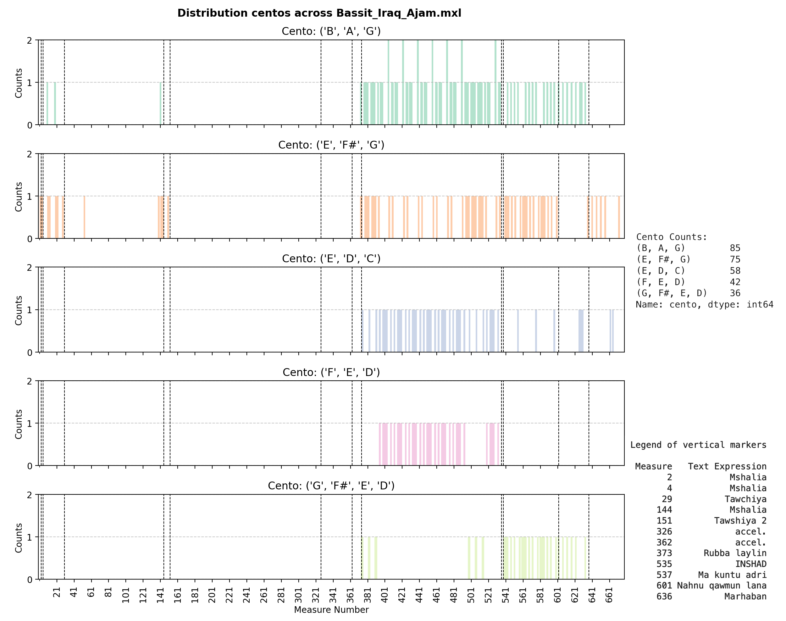
This score shows a different pattern:
- Similar centos but with different frequencies
- Different structural markers (visible as vertical lines)
- Variations in how motifs cluster around sections
Example 3: Multiple Quddam Versions
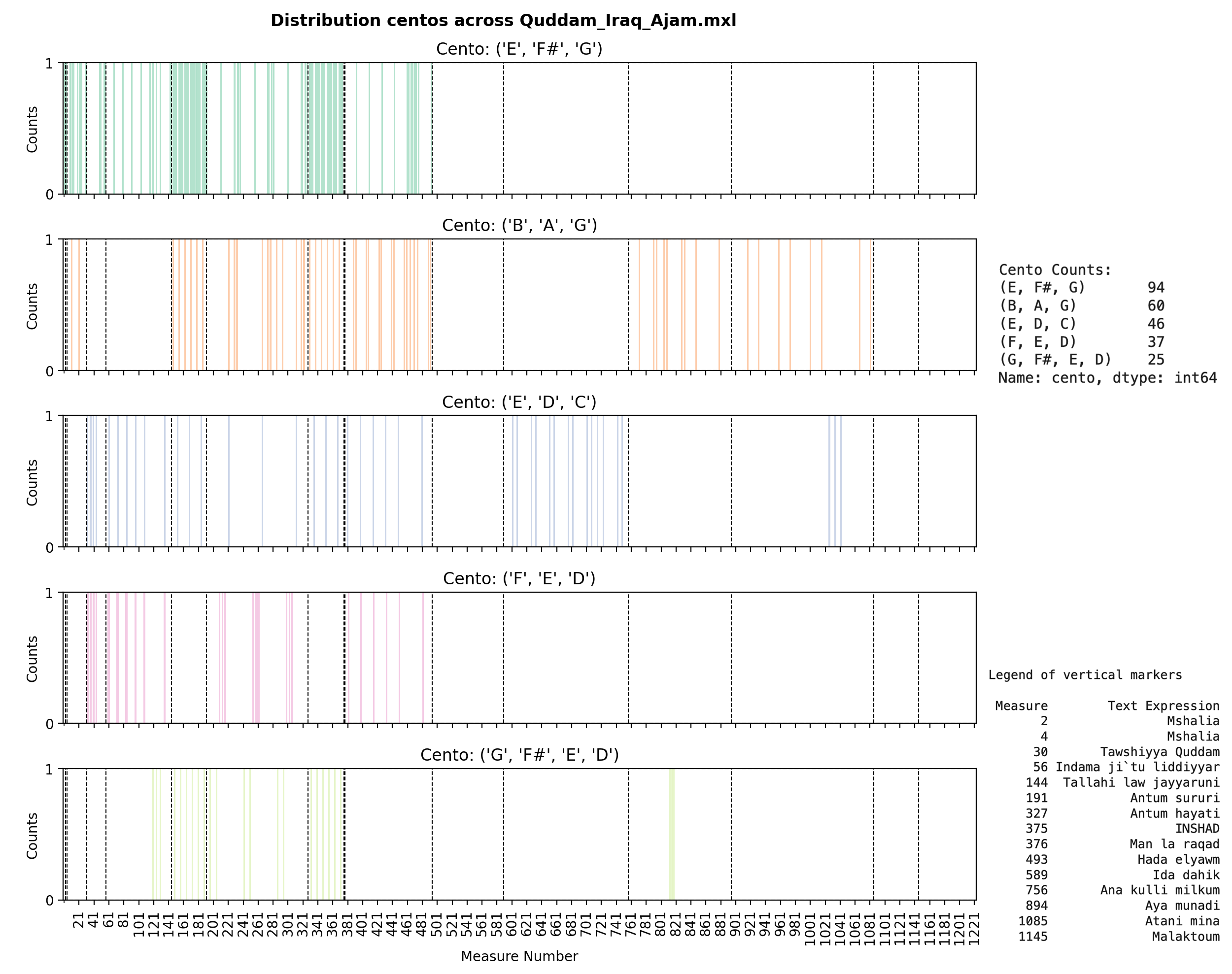
Comparing different versions of the same piece (Quddam) reveals:
- Consistency: Same centos appear across versions
- Variation: Different frequencies and distributions
- Structure: How the same musical material is organized differently
Best Practices for Musical Visualization
1. Choose Appropriate Scales
# For timeline plots, use measure numbers, not time
# This aligns with how musicians think about structure
ax.set_xlabel('Measure Number')  # ✅ Good
ax.set_xlabel('Time (seconds)')   # ❌ Less useful for structural analysis
2. Include Contextual Markers
# Add section markers, key changes, tempo markings
for section, measure in text_expressions.items():
    ax.axvline(x=measure, color='black', linestyle='--',
              label=section, alpha=0.5)
3. Make Plots Reproducible
# Set random seed for any stochastic elements
np.random.seed(42)

# Use consistent styling
plt.style.use('seaborn-v0_8-whitegrid')  # or your preferred style
4. Export at High Resolution
# For publications, use high DPI
plt.savefig(output_path, dpi=300, bbox_inches='tight')
5. Consider Your Audience
- Musicians: Focus on measure numbers, section labels, musical terminology
- Researchers: Include statistical measures, confidence intervals, error bars
- General audience: Simplify, add explanations, use intuitive color schemes
Common Pitfalls and Solutions
Problem: Overlapping Elements
Solution: Use transparency and adjust spacing
ax.bar(x, y, alpha=0.7, width=0.8)  # Transparency helps
plt.tight_layout()  # Adjust spacing automatically
Problem: Too Many Motifs
Solution: Group or filter
# Show only top N motifs
top_motifs = sorted(motif_counts.items(),
                   key=lambda x: sum(x[1].values()),
                   reverse=True)[:5]
Problem: Inconsistent Colors
Solution: Create a color mapping dictionary
motif_colors = {motif: color for motif, color in
                zip(unique_motifs, create_colormap(len(unique_motifs)))}
# Use motif_colors[motif] consistently across all plots
Integration with Analysis Pipeline
Here’s how visualization fits into a complete analysis workflow:
# 1. Load and analyze
score = load_score("Btaihi_Iraq_Ajam.mxl")
melody = extract_melody(score)
motifs = identify_motifs(melody, min_length=3, max_length=5)

# 2. Process and count
motif_counts = identify_unique_motifs(melody, normalize_octave=True)
text_expressions = extract_text_expressions(score)

# 3. Visualize
plot_motif_distribution(motifs,
                       title="Motif Length Distribution",
                       output_path="plots/distribution.png")

plot_motif_timeline(score, motif_counts, text_expressions,
                    filename="Btaihi_Iraq_Ajam",
                    output_path="plots/timeline.png")
Conclusion
Effective visualization is essential for computational musicology research. The functions we’ve explored provide:
- Distribution analysis: Understanding motif characteristics
- Temporal visualization: Seeing patterns across time/structure
- Color mapping: Distinguishing multiple motifs clearly
These visualizations transform raw motif data into insights about musical structure, style, and development. Combined with the motif identification methods from the previous post, you have a complete toolkit for computational motif analysis.
For complete implementations and interactive notebooks, see the Arab-Andalusian Motif Development Analysis and the GitHub repository.
Further Reading
- Matplotlib Documentation
- Seaborn Statistical Visualization
- ColorBrewer: Color Advice for Maps
- Plotly Interactive Visualization
This post is part of a series on computational musicology and music information retrieval. Read the previous post on motif identification and explore the interactive notebook for hands-on examples.
Tagged with:
Related Posts
Analyzing Musical Scores and Identifying Motifs: A Comput...
A deep dive into computational methods for analyzing musical scores and ident...